Benjamin Moore Names “Simply White” The Color of The Year
Sam Lutz • November 17, 2015
Every year, Benjamin Moore picks a color of the year. It’s a big deal in the world of paints, decor and interior design. Just recently, Benjamin Moore released their color of the year for 2016. It’s called Simply White. You can see this color on the Benjamin Moore website
and you can also see pictures of this color in action here.
So you may have many questions about this issue. Why did Benjamin Moore pick a shade of white for its color of the year? Is white even a color? Can they do that? And why Simply White? How does Simply White compare to other whites in the Benjamin Moore collection? In this post, we’ll explore the answers to these questions.
Is White a Color?
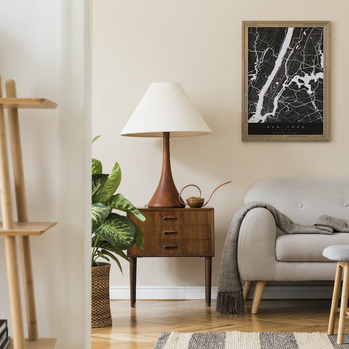
Technically, white is a neutral. However, from an interior design standpoint, it is as much a color, and has as much character, as any shade of brazen red or gentle blue. It’s also versatile. Very versatile.
In a kitchen, white has refreshing cleanliness that makes food look tasty and meal preparation enjoyable. In spaces with natural light, white takes on depth as it reflects colors from the outdoors. Against hardwood floors, white is “rustic.” Paired with black, it’s modern. Scattered around a room against a dark backdrop, white has sharpness that punctuates the visual field. It’s an all-purpose color with a fundamental beauty that makes it one of the most useful colors in the spectrum.
Why Simply White?
So, why did Benjamin Moore pick Simply White? Why not another white? The answer to this question is involves the way white works in different settings and how different shades of white have differences of character.
By itself, each shade of white looks like the only white there is. It’s hard to tell the difference between one white and another when all you’re looking at is a swatch in a paint store. Yet white has a way of being warm or cool, having a touch of yellow or a touch of blue, that changes the way it appears on the wall, placed near other colors.
Consider the difference between milk and a fluorescent light bulb. Both may look white, but the fluorescent light bulb has a blue-ish cast, while the milk has creaminess. All whites are like this, possessing character that leans to one side or another. Some whites may have a little green, others may almost look red.
Simply White was chosen because it’s a close approximation to actual white. The Platonic Ideal of white. It’s a blank slate, in a manner of speaking. It matches well with warm colors, cool colors, all the colors. It’s just a beautiful, refreshing shade of white.
How Does This Affect You?
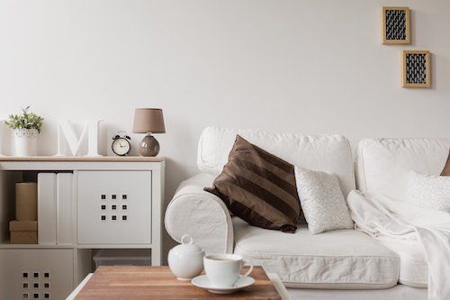
Everything matches Simply White. All the colors. Your brown couch and your red cabinets and your sky-blue table will all look beautiful in a room with Simply White on the walls. In fact, you can change your decor and it will always match Simply White. As a homeowner, this means you’ll be able to live with the same color on your walls for many years, loving every minute of it.
At Ace Paint and Unfinished Furniture, we invite you to try Simply White for yourself. We carry Simply White and all the other shades of Benjamin Moore paint that you could want. Stop by our store any time for your interior paint needs.
There are all kinds of wooden furniture: modern, antique and everything in between. We’ve talked about style differences, but what about how it’s made and what it’s made of? Is there a large difference between the wood furniture of today and yesterday?
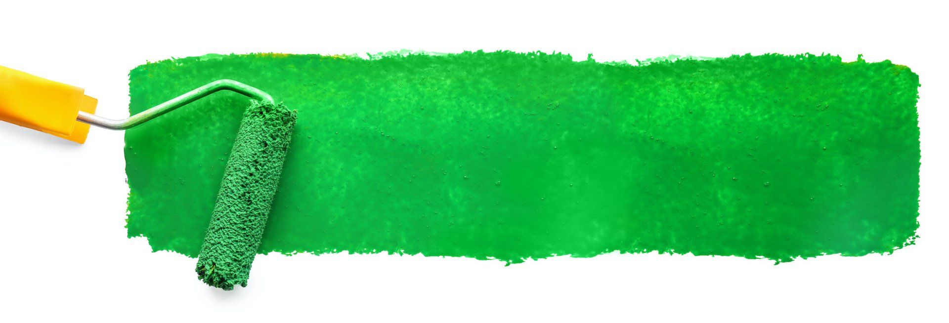
Colors are so fascinating. They make us feel, they help us express how we feel. The right colors can really set the mood in a room, or on an outfit. There’s a lot to color theory and what each of the colors mean. This St. Patrick’s Day we thought it’d be fun to explore a little about green.
One of the wonderful things about good wood furniture is that it doesn’t have to be merely functional. It can be beautiful as well. We’ve seen some amazing pieces made with wood stains that are more than just furniture, they’re works of art. So if you’ve got an old table, desk or other piece of wood furniture that needs jazzed up, why don’t you consider using some of our great stains to try one of these ideas.
What's your furniture style? Here’s a few of the more popular styles and the kind of look they give your home.
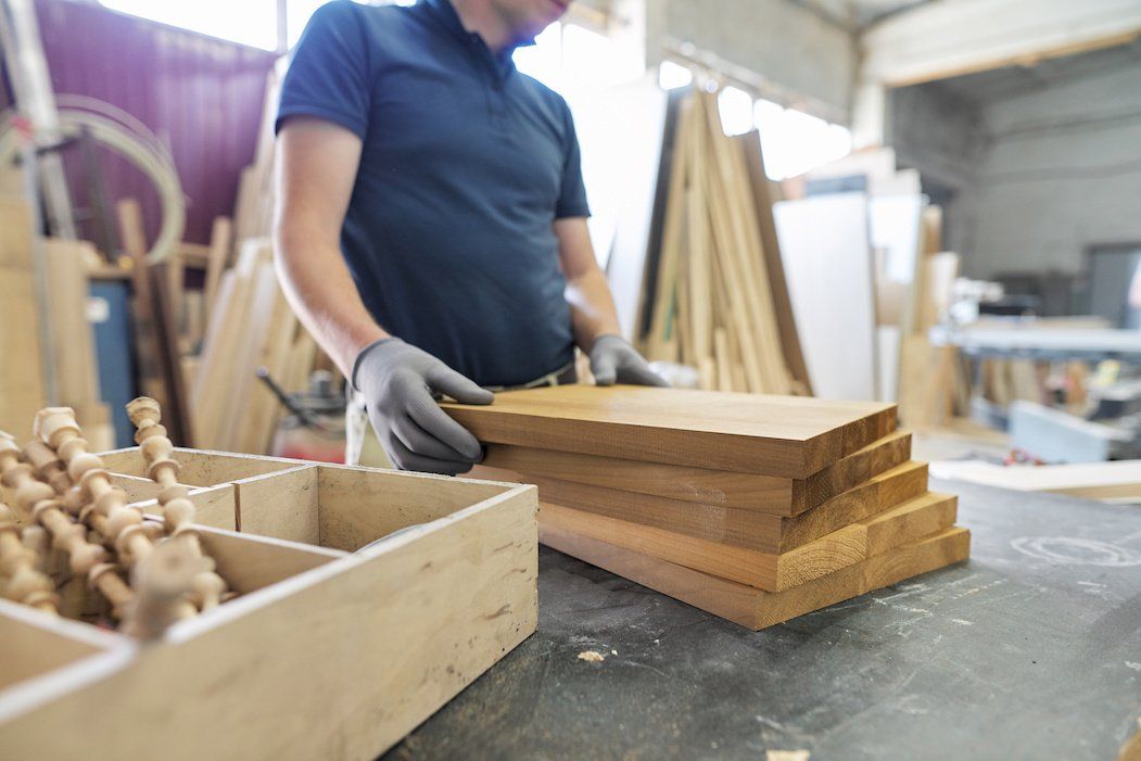
Wood is our most basic raw material used for creating furniture. Wood furniture is timeless, and the aesthetic options are endless. Let’s talk about a few today, shall we?
The 2010s saw an uptick in modern interiors, bringing in clean lines to decor and furniture, so what does the new decade have in store? Restyle your home for the new year with the latest trends.
Are they bright and bold? Wild and wacky? It’s a thrill for our industry to learn what the latest “in” colors will be each year, and they never disappoint. The color trends for 2020 include shades of green, blue and pink, and each have an inherent welcoming quality.
Holiday parties are part of the magic of the season, but the cleanup is a pain—especially when furniture is involved. Prevent disasters with a few tips on how to protect your furniture during holiday parties.

The holiday season has arrived, and soon every corner will be decked out in red and green. But have you ever stopped to think about what holiday colors mean?
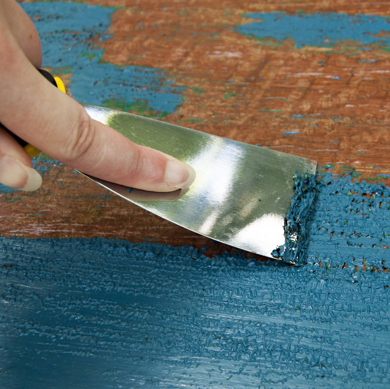
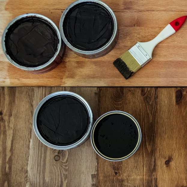
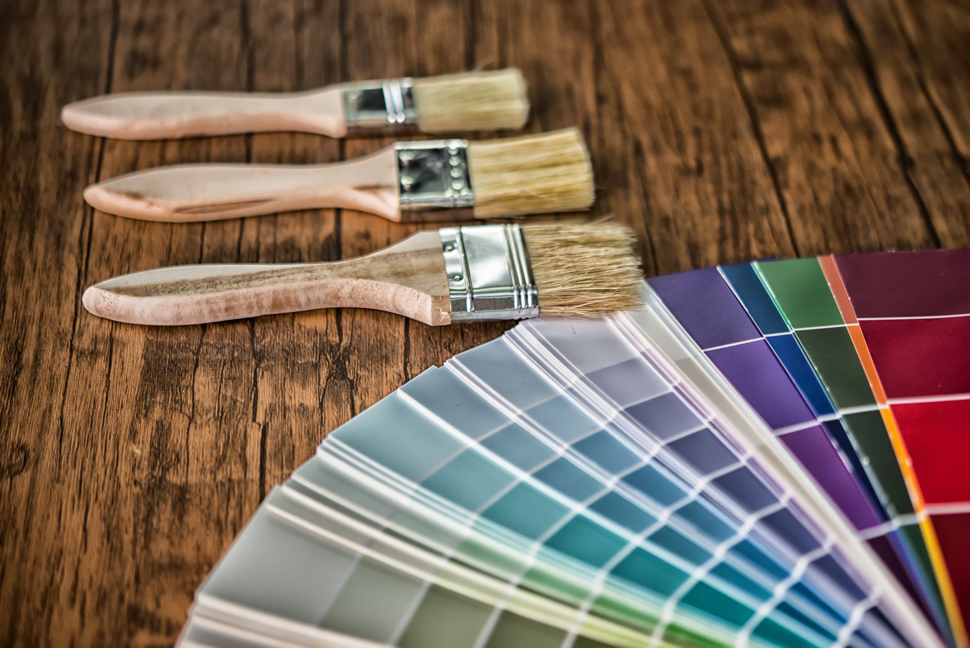
Restaining an old piece of furniture with a new varnish color can go a long way, but first you need to remove the old stain color.