The 5 Top Benjamin Moore Greys
Sam Lutz • March 10, 2015
We've decided to dedicate this post to the most elegant of all paint neutrals: grey. It's soothing and soft, gentle and just a tiny bit moody. In this piece, we've listed the top five Benjamin Moore greys. As you consider which neutrals to paint on your walls, give thoughtful consideration to these subtle and sophisticated shades of gray.
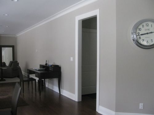
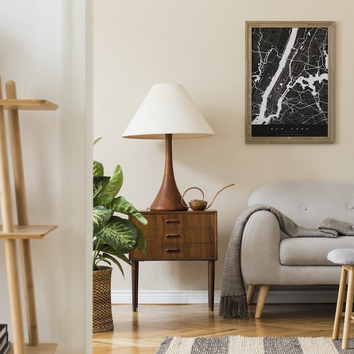
Edgecomb Gray
Warm and soft, and just a little bit understated, Edgecomb Grey is the perfect color for a home library, bathroom or hallway. It's crisp and soothing, reserved and intelligent. Imagine it in your living room, with accents of walnut or soft cherry in the floors and furnishings. Edgecomb Grey pairs well with a range of building and furnishing materials, like dark hardwood floors, white marble countertops and soft, worn leather. For more ideas, check out this Houzz page
dedicated to Edgecomb Grey.
Metropolitan
Benjamin Moore's Metropolitan
is the sort of color that seems to change with its surroundings. Here, it looks darker and more sophisticated, there, it's light and gentle. It has a hint of blue which stands out when compared to other greys. To emphasize the cool undertones of this color, use light blue accent colors thrown about the room, in pillows and curtains. We recommend using Metropolitan in the dining room, bedroom or kitchen. For more ideas, take a look at this page
with pictures of Metropolitan in everyday settings.
Revere Pewter
This light grey paint has a slight warmth to it, for those of you hoping to avoid the steely aloofness of some cooler greys. Revere Pewter
looks its best with mid-tone hardwood floors and soft leather chairs. We recommend Revere Pewter for small spaces where darker colors would make the room look too small or confined. To see Revere Pewter in action, check out this page of photos.
Kendall Charcoal
Kendall Charcoal
seems to appear on all the top 5 lists of greys, including the official Benjamin Moore list. Maybe that's because Kendall Charcoal is so bold and eye-catching--used in just about any setting, it makes a striking impression. It's a dark color, but not so dark that it dampens the mood of a room. Used properly, Kendall Charcoal just looks smart and daring. We recommend pairing it with shades of stark white and earth tones, as you'll see in these photographs.
Moonshine
We love this color for its mystical lightness. The barely-there quality of Moonshine
makes it perfect for big spaces where you want to emphasize the furniture, floors or artwork on the walls. Moonshine adds to the quality of a space without demanding attention. Check it out in these photos online.
Want more ideas? Are you now seeking the perfect shade of Benjamin Moore grey? Stop in at Ace Paint and Unfinished Furniture
for more advice and paint samples. We'd love to help you pick the perfect shade of grey for your home, inside or out.
There are all kinds of wooden furniture: modern, antique and everything in between. We’ve talked about style differences, but what about how it’s made and what it’s made of? Is there a large difference between the wood furniture of today and yesterday?
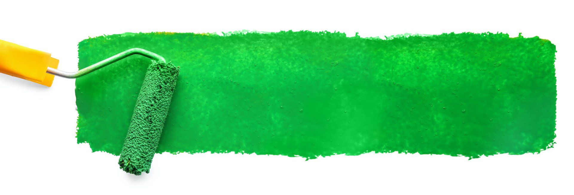
Colors are so fascinating. They make us feel, they help us express how we feel. The right colors can really set the mood in a room, or on an outfit. There’s a lot to color theory and what each of the colors mean. This St. Patrick’s Day we thought it’d be fun to explore a little about green.
One of the wonderful things about good wood furniture is that it doesn’t have to be merely functional. It can be beautiful as well. We’ve seen some amazing pieces made with wood stains that are more than just furniture, they’re works of art. So if you’ve got an old table, desk or other piece of wood furniture that needs jazzed up, why don’t you consider using some of our great stains to try one of these ideas.
What's your furniture style? Here’s a few of the more popular styles and the kind of look they give your home.
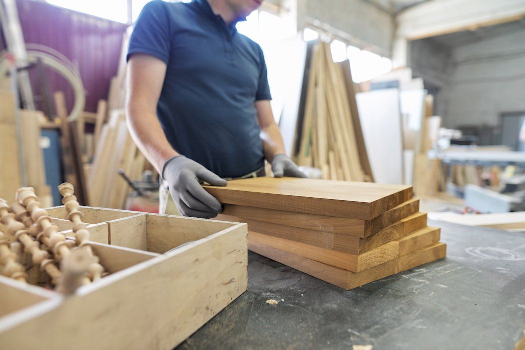
Wood is our most basic raw material used for creating furniture. Wood furniture is timeless, and the aesthetic options are endless. Let’s talk about a few today, shall we?
The 2010s saw an uptick in modern interiors, bringing in clean lines to decor and furniture, so what does the new decade have in store? Restyle your home for the new year with the latest trends.
Are they bright and bold? Wild and wacky? It’s a thrill for our industry to learn what the latest “in” colors will be each year, and they never disappoint. The color trends for 2020 include shades of green, blue and pink, and each have an inherent welcoming quality.
Holiday parties are part of the magic of the season, but the cleanup is a pain—especially when furniture is involved. Prevent disasters with a few tips on how to protect your furniture during holiday parties.

The holiday season has arrived, and soon every corner will be decked out in red and green. But have you ever stopped to think about what holiday colors mean?
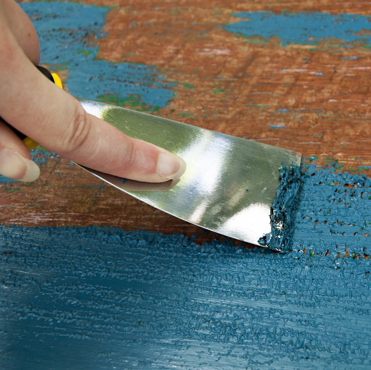
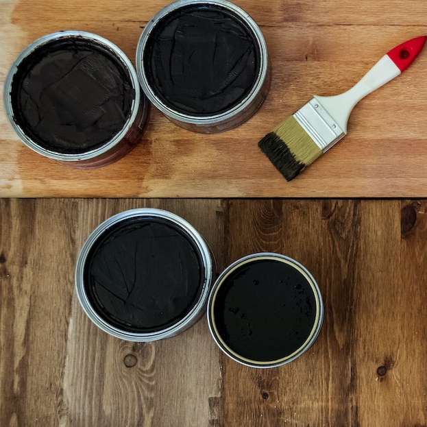
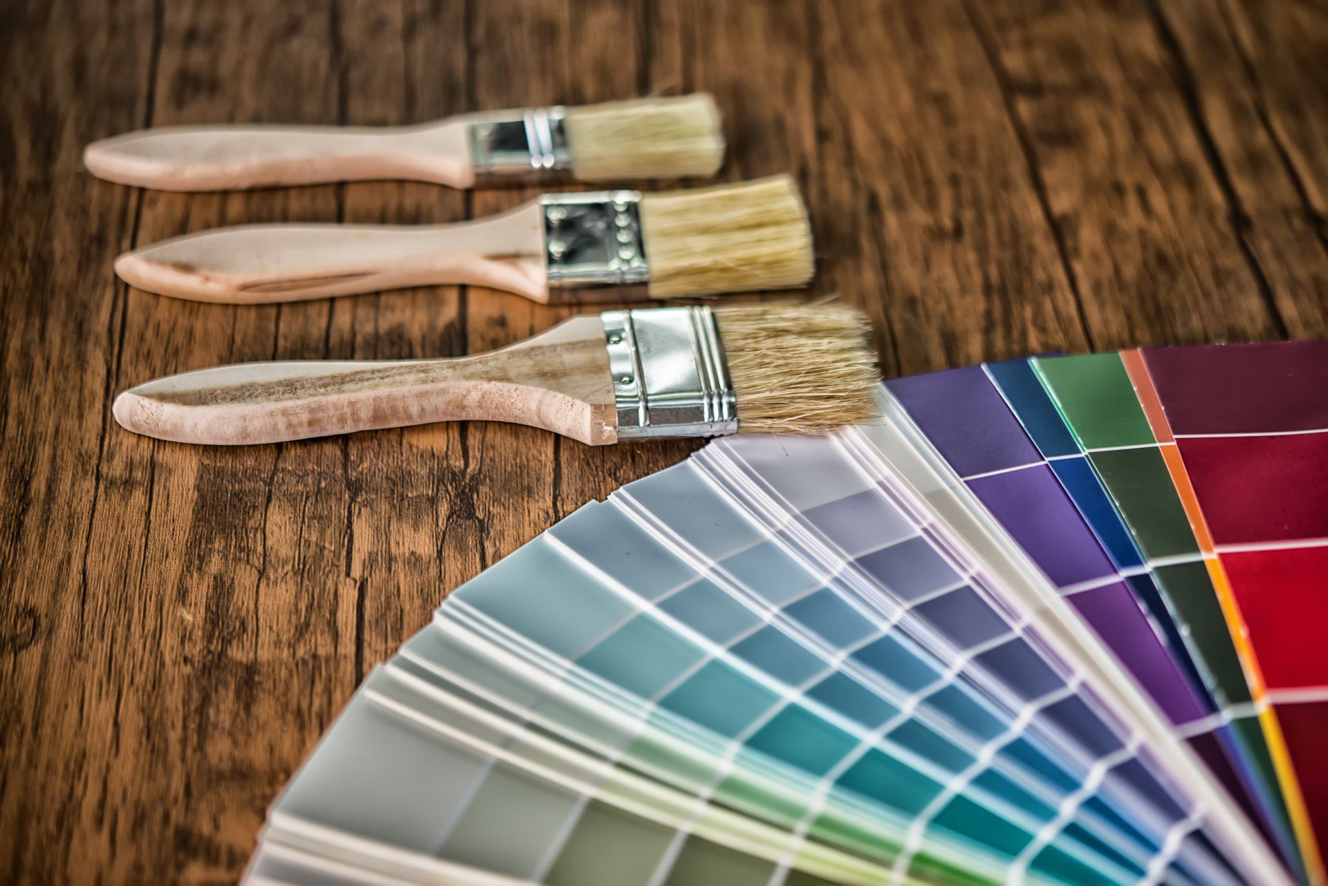
Restaining an old piece of furniture with a new varnish color can go a long way, but first you need to remove the old stain color.